.png)
.png)
Heuristics Evaluation Information Architecture
User Archetypes
User Journey
.png)
Competitive Analysis
Mind Map
Workflow
Wireframes
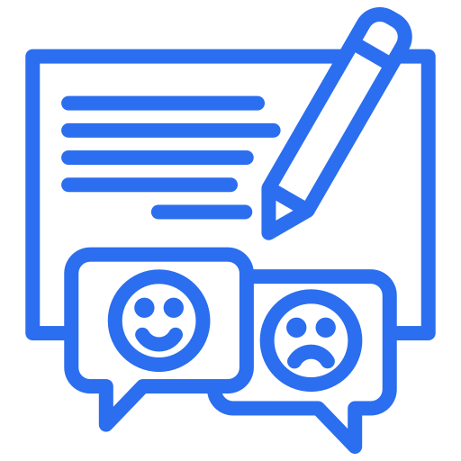
Suggestion & Feedback
Further Development
Final Screens
Style Tiles
I first set out to took a broad look onwards to the existing design, and found many issues that were compromising the current user experience, giving me clear insights into what needed improvement.
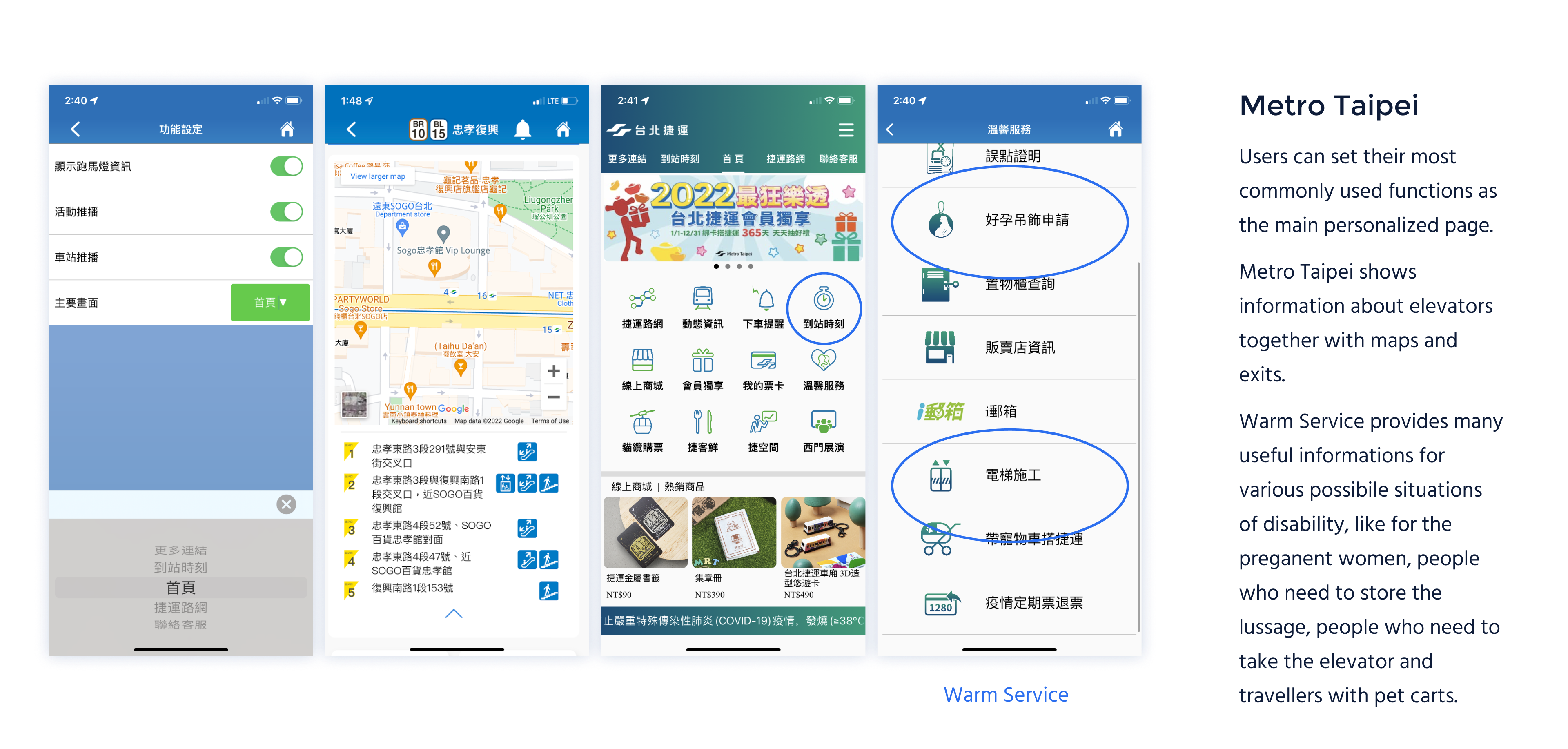
What surprised me is that the information about facilities is already included in this app.
.png)
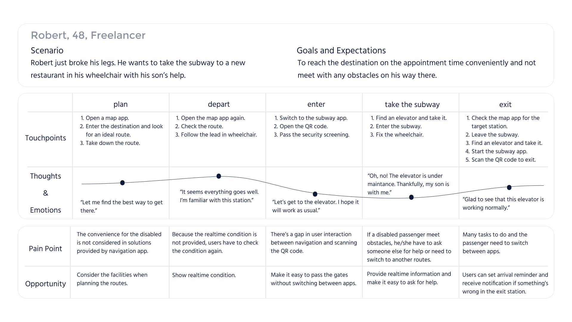
Passengers may have different limitations in abilitiy, and encouter various difficulties. The main problem is how to summarize the complex needs of users and find a universal solution.
The first thing that came to my mind is to conduct interviews, but still found it hard to systematically identify their similarities.
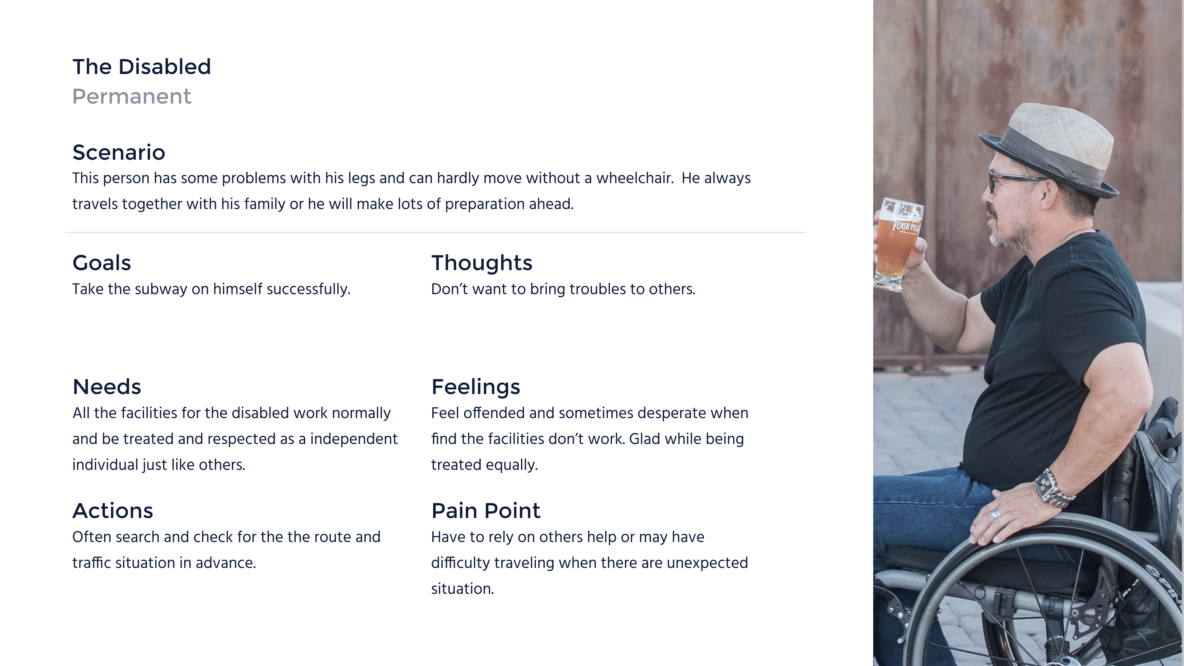
I continued my research and drew inspiration from the methodology of inclusive design, categorizing the users into three groups: the situational,temporary and permanent disabled.
For passengers with permanent disabilities, what we need to provide is effective information and respect, giving them the ability to travel independently.


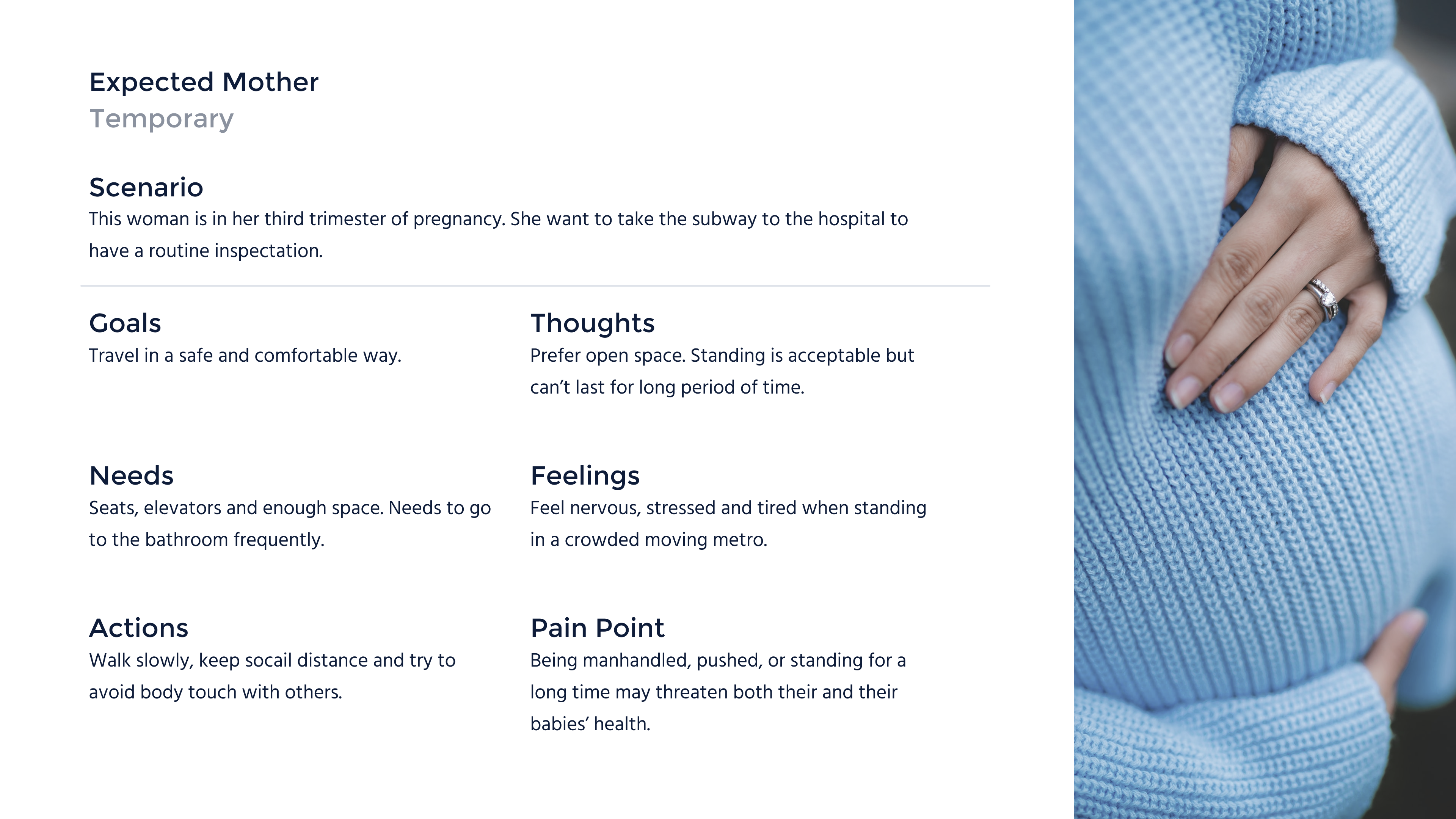
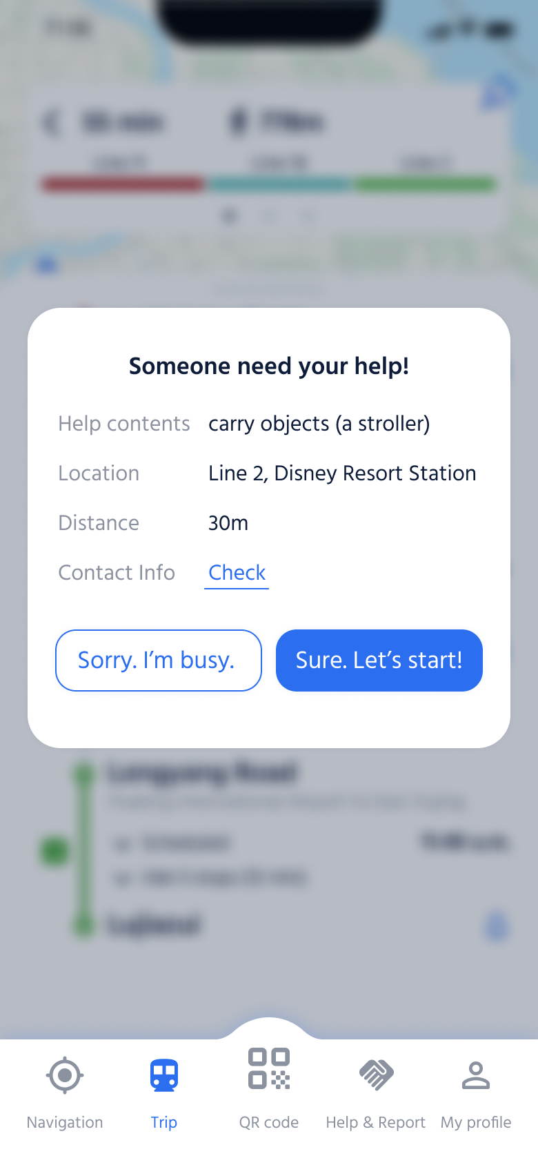
Passengers may also encounter unexpected situations where they require external assistance, so it is necessary to provide them with additional channels for seeking help.
I integrated the insights from the interviews and research findings into this user journey.
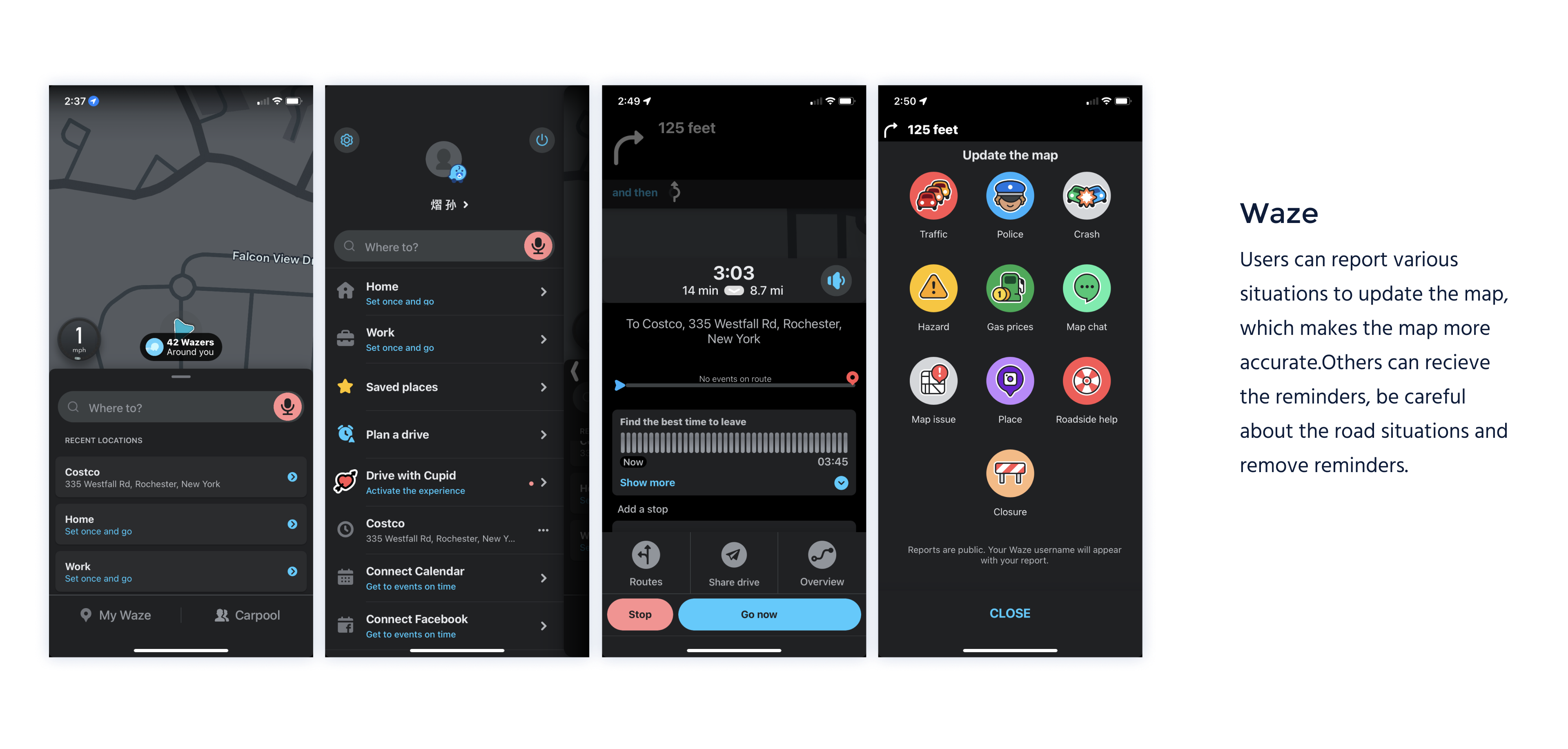
After figuring out users' pain point, I started to develop the solutions. In order to have some inspirations, I tried to experience many other apps that work to solve public transportation problems. One key feature that inspired me it to use real-time information to help users plan their trip in advance.

Based on previous user research and evaluation of the existing system, I focused on 3 pain points, and develop some useful ideas:
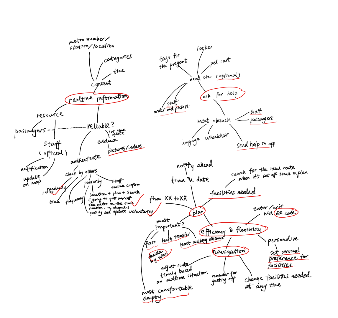
Combining the inspiration I obtained from other apps and the pain points discovered in user research, I utilized a mind map to brainstorm and refine features. I organized the user flow, and it includes 4 parts:
The app structure corresponding to the user flow should include the following features:
to search for realtime information about subways and facilities, to plan or start a trip, to report problems or seek help, and to receive pop-up windows for checking facilities status or asking for help, and using the QR code is indispensable.
.png)
The app consists of 5 parts:
.png)
After finishing the low-fidelity prototypes, I presented it to others to have usability testing and iterated the wireframes.
.png)
Simplified the questions in the Help&Report section, added clear titles and back buttons.
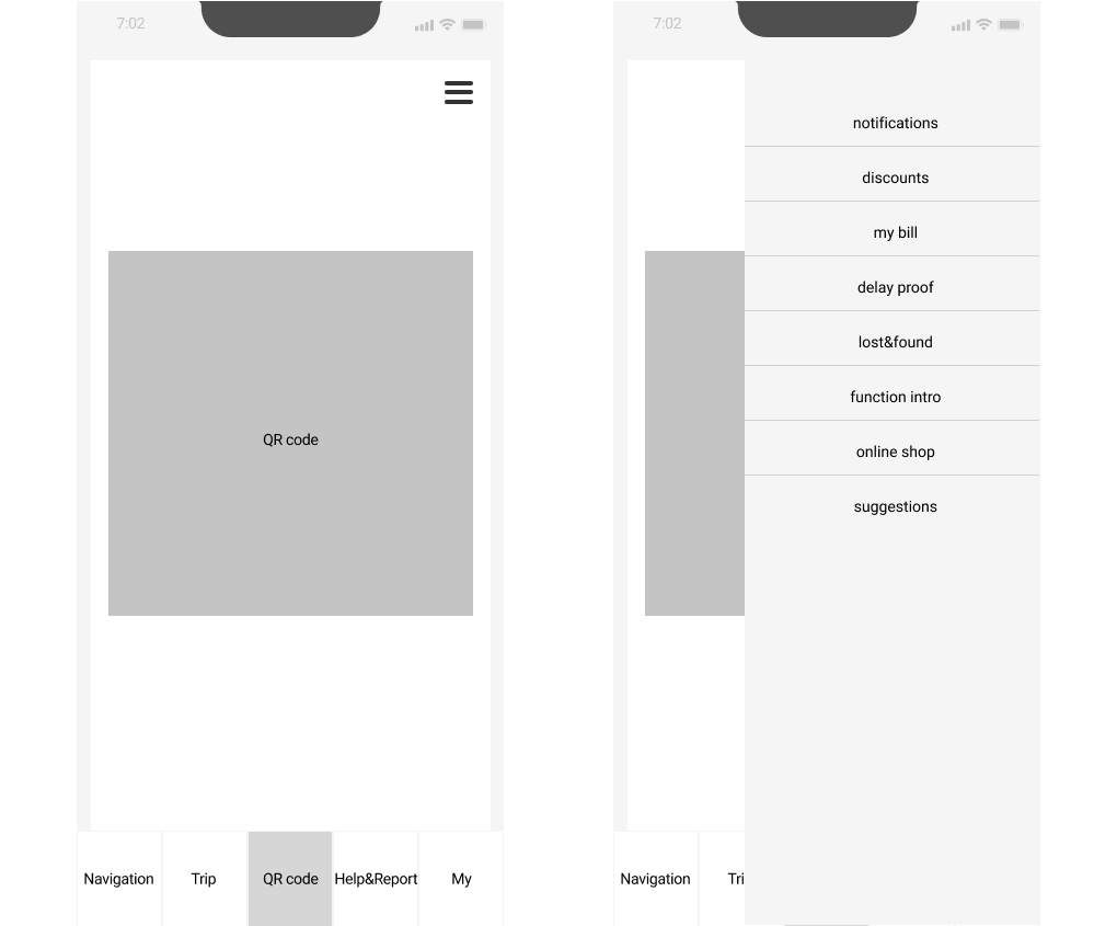
Move the hamberger button to the homepage(QR code section) considering the relevance.
.png)
.png)
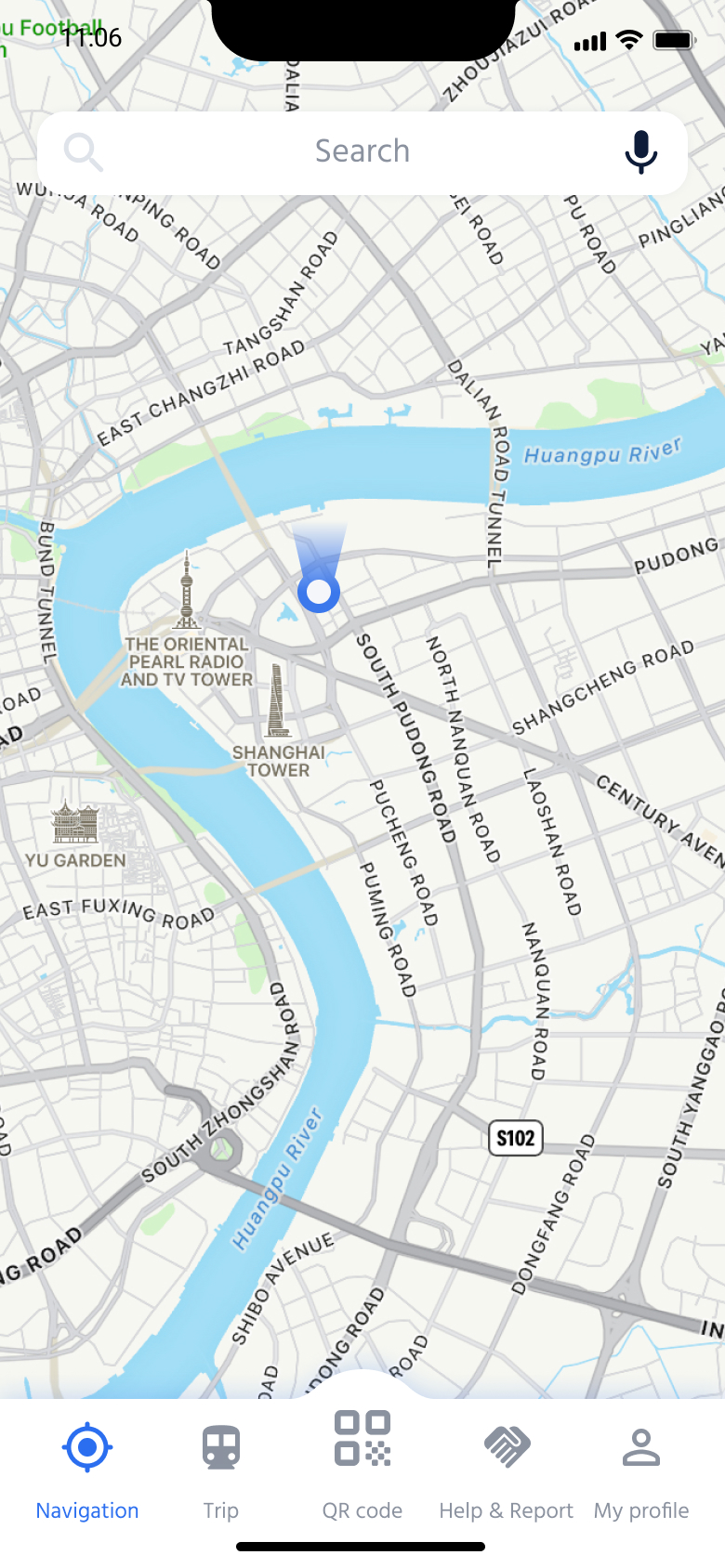
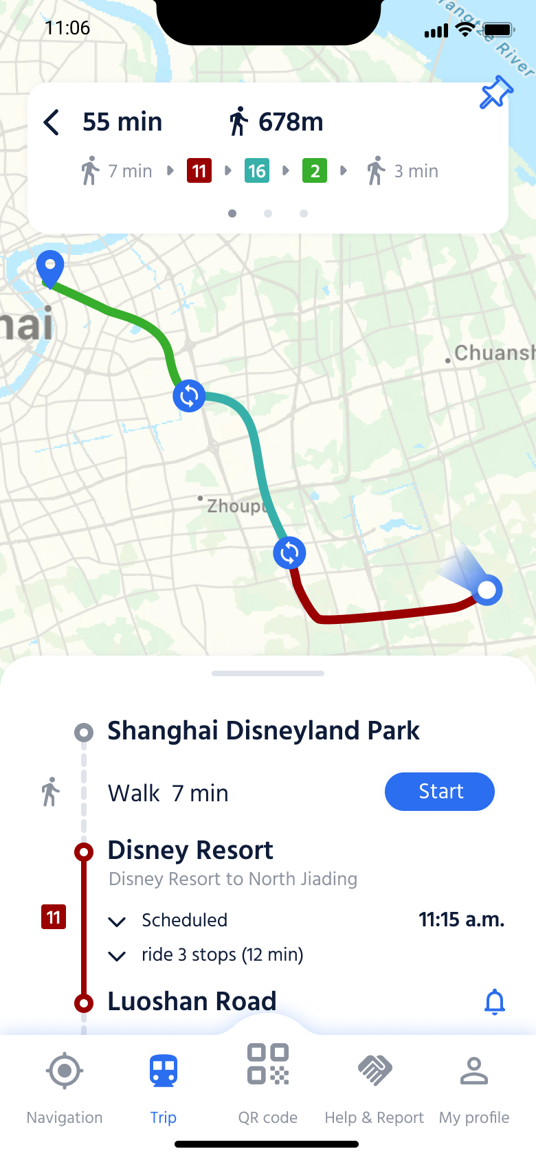
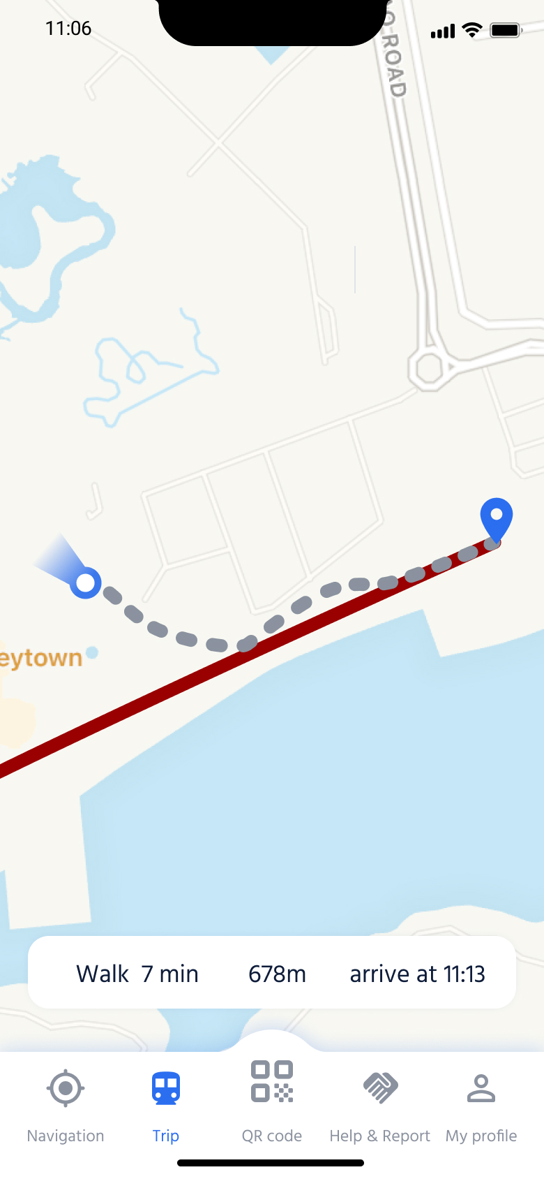
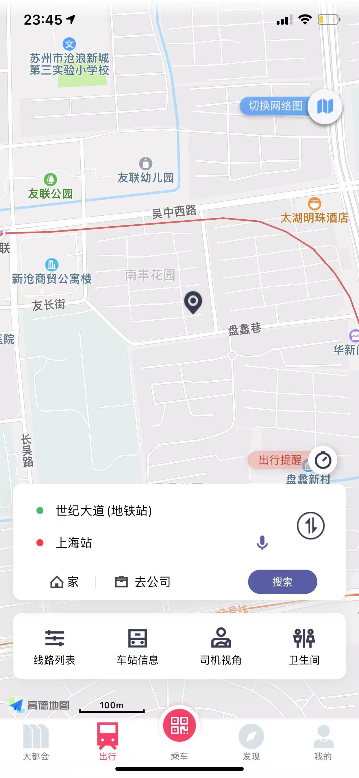
The initial screen of Navigation display a map of the user's location.
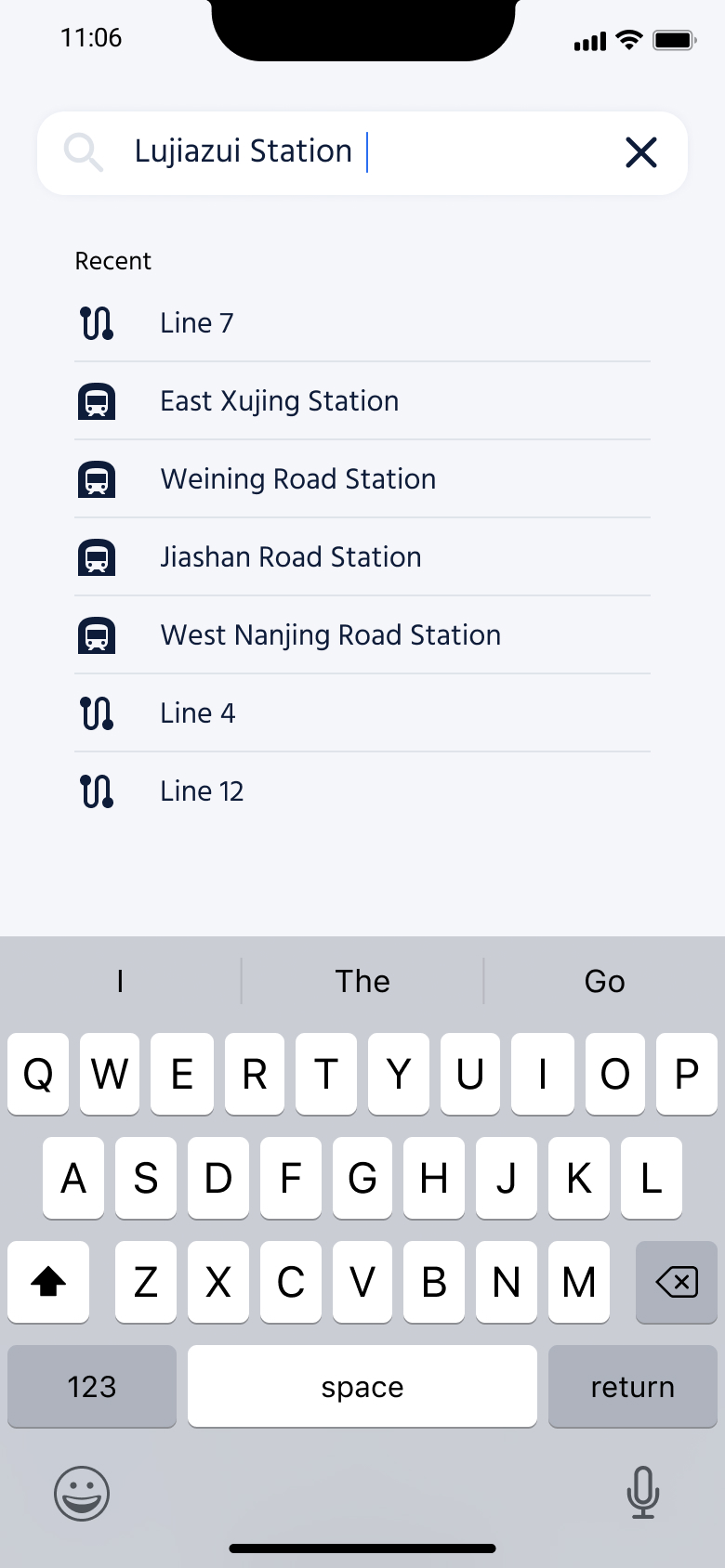
Users can type in the name of a station or line or choose from within a recent search.
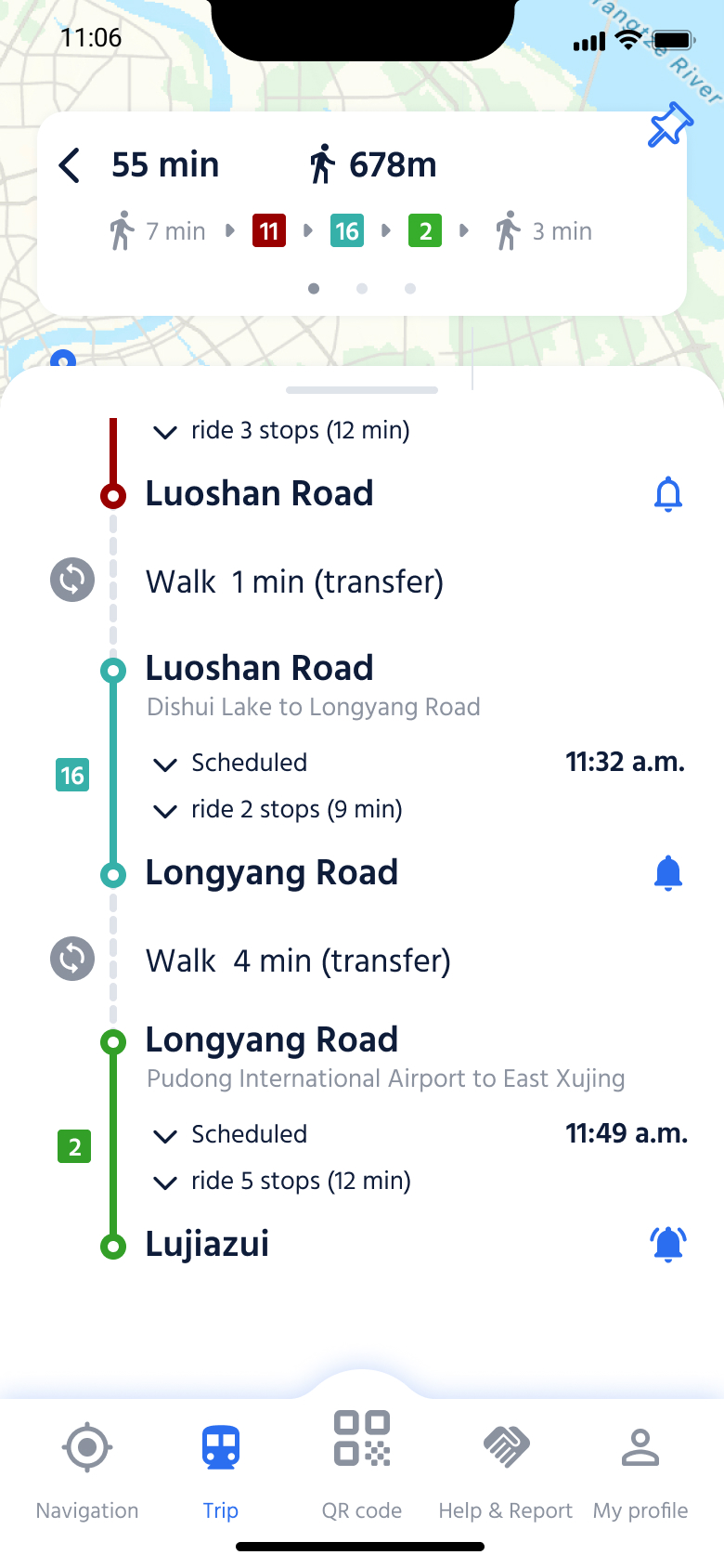
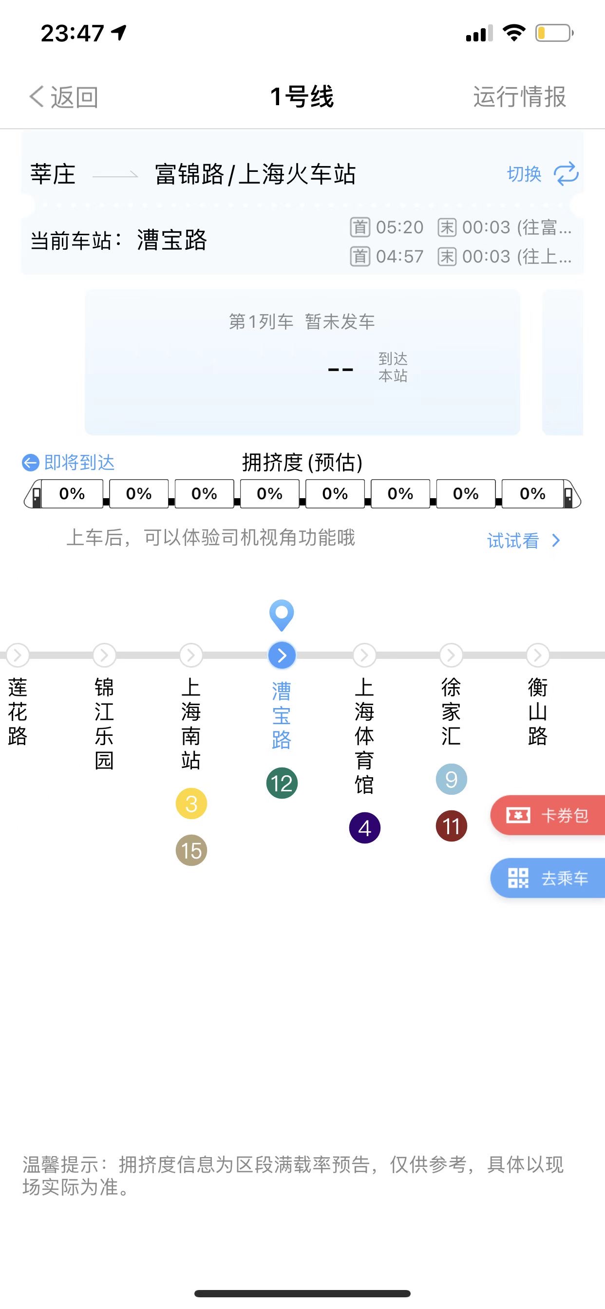
An overview metro route and the current location of this line can be seen on the map. It shows the status of facilities and toilets, as well as the lines that passengers can transfer to.
Station screen shows the information about toilets, facilities and exits in one station and navigates to them.
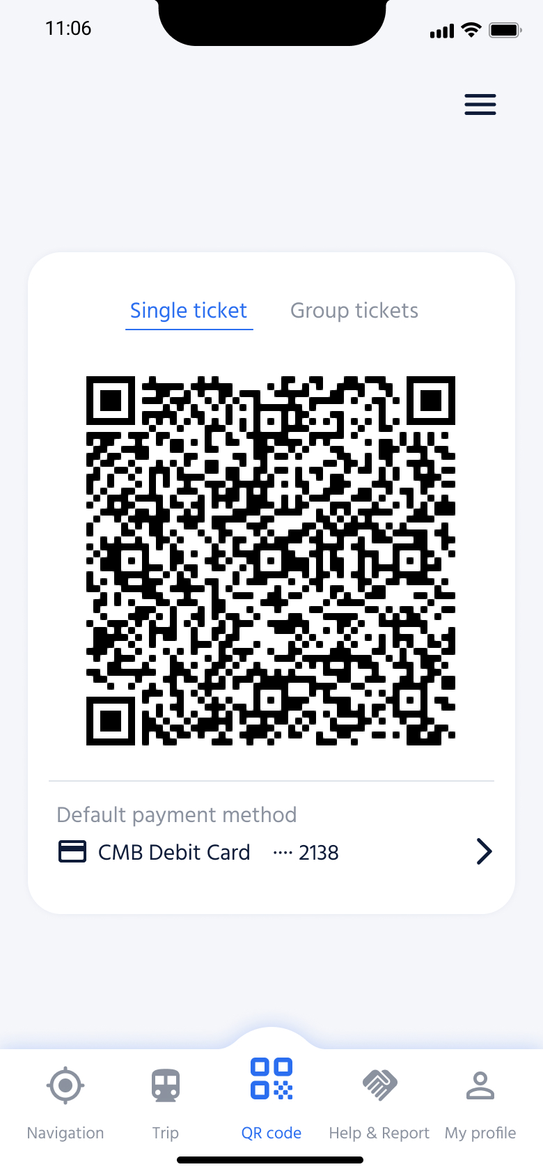
QR Code is the home screen of this app, which is the function used most frequently by everyone. Users can start the app and scan the QR code to enter the station.
Some other additional functions can also be reached easily in this screen.
.png)
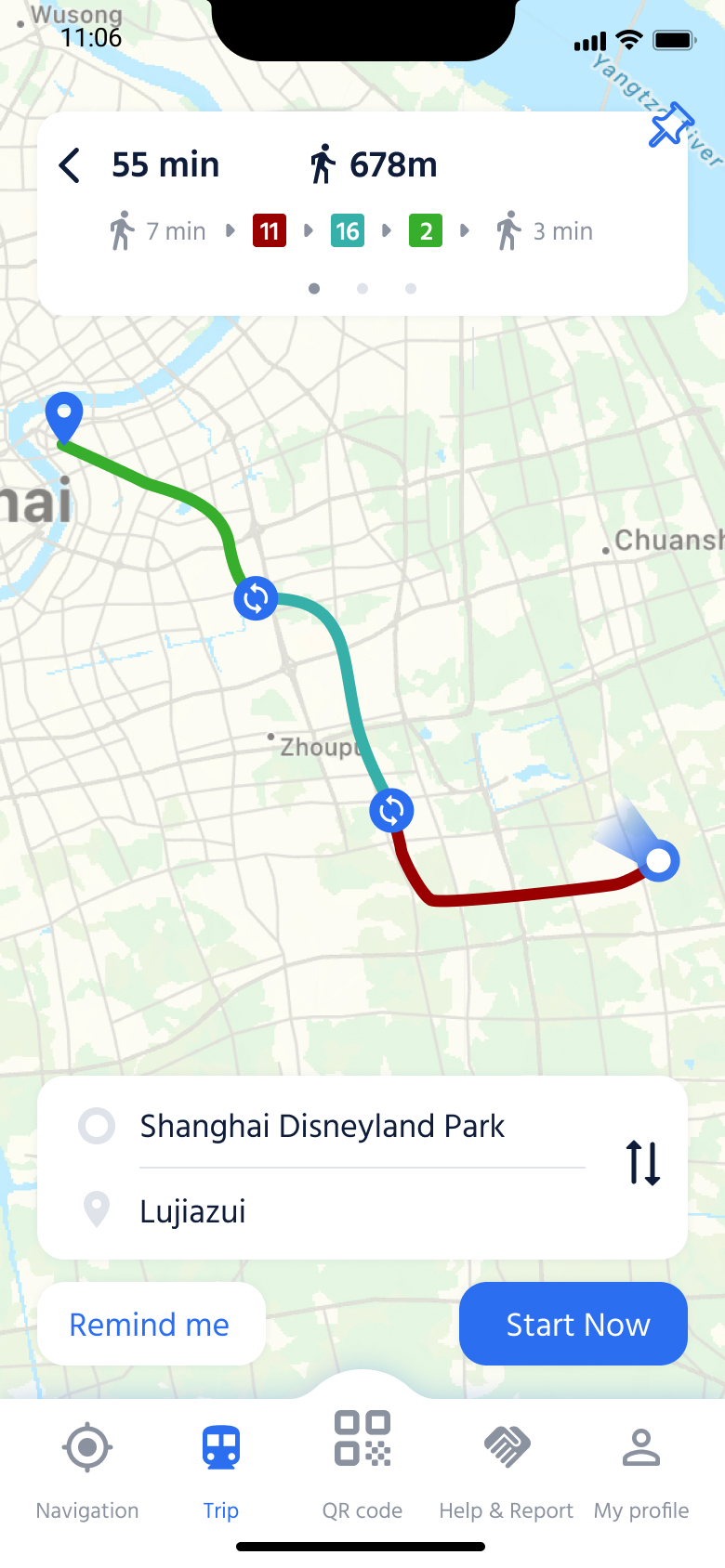
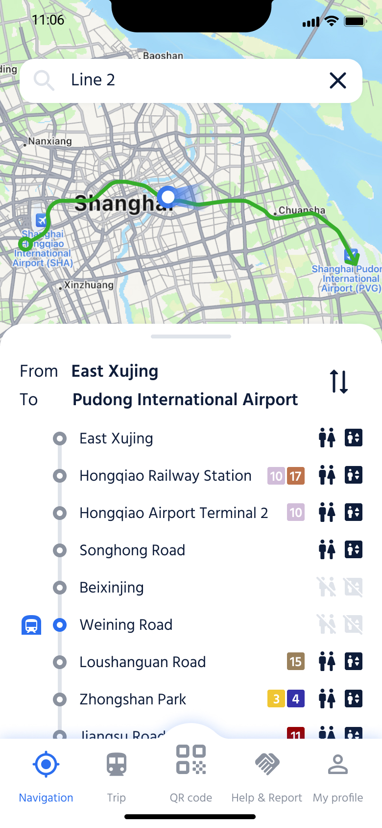
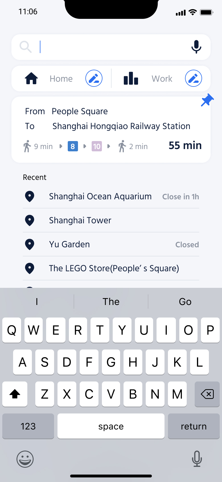
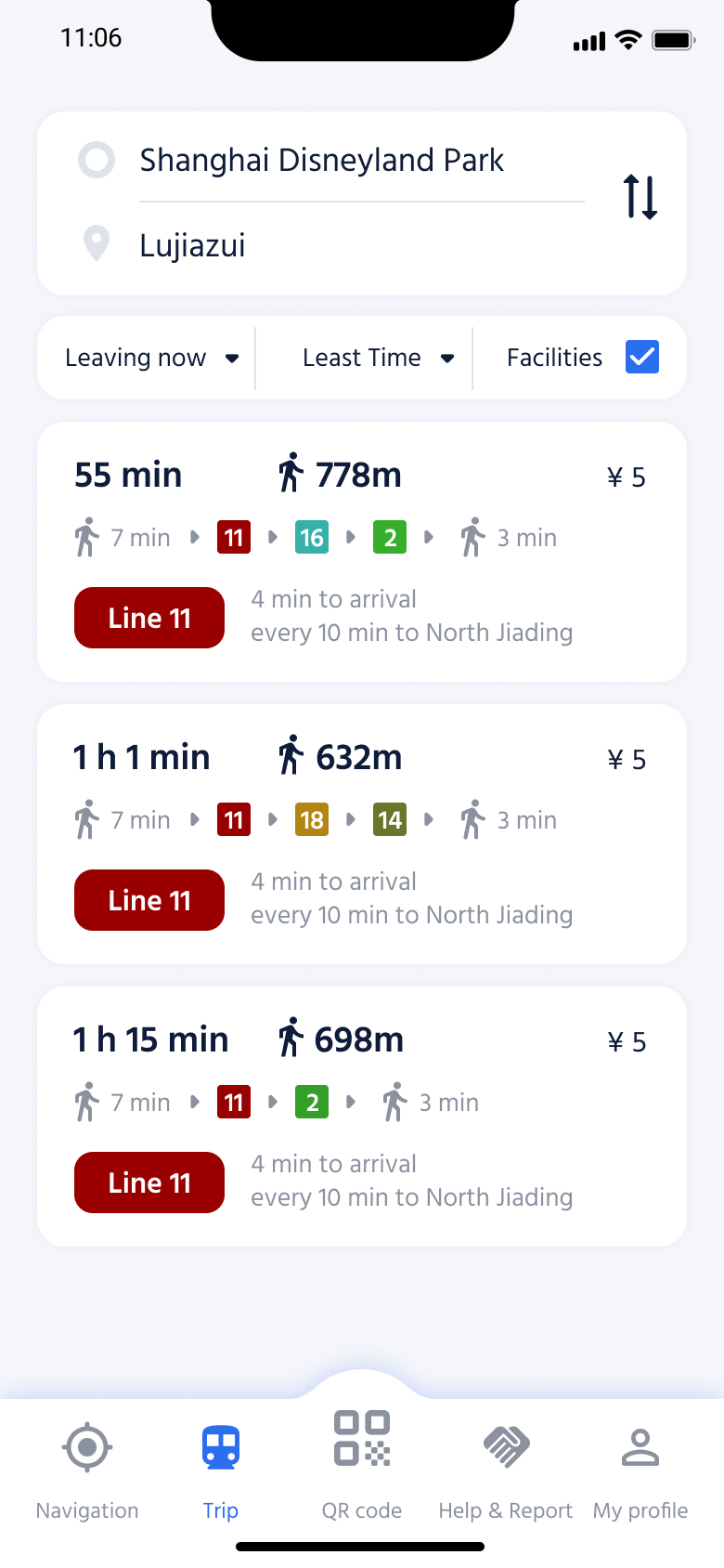
Users can search routes, set home and work locations, and pin favorite routes for quick access. They can customize their route preferences, such as fastest travel time, minimal walking, fewer transfers, or less crowded options.
Additionally, users can enable facility information to be factored into their route suggestions.
.png)
.png)


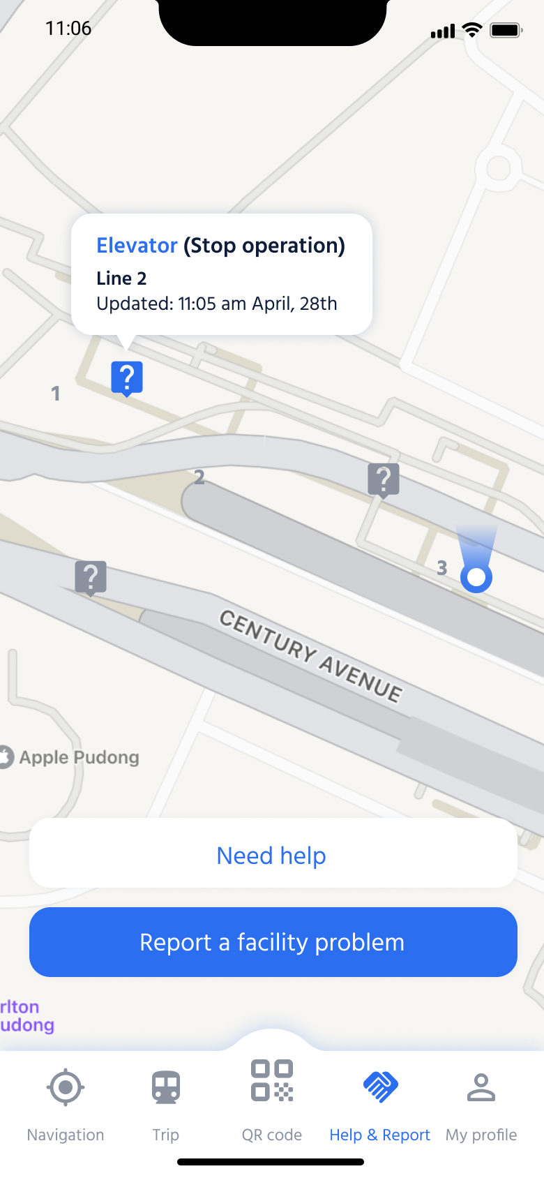
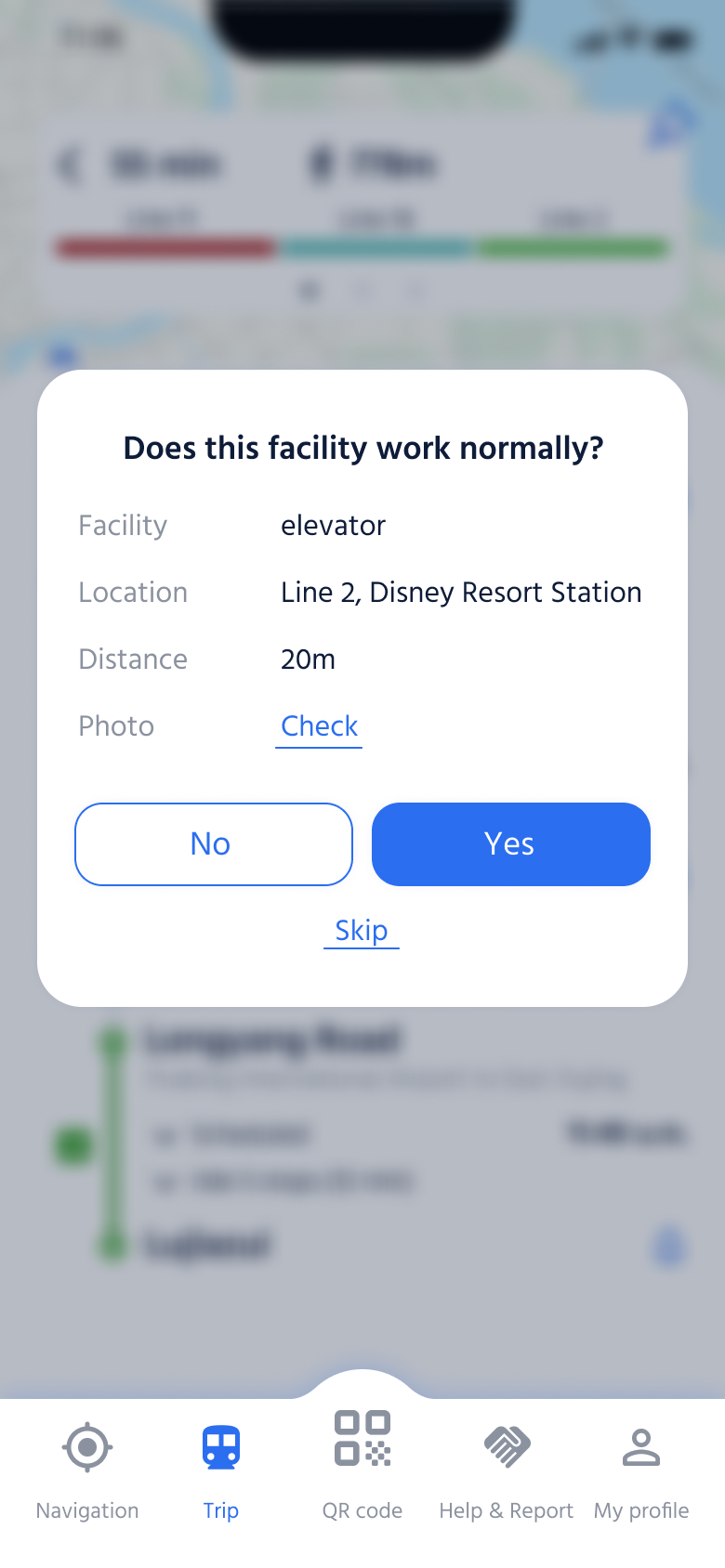
Users can either send a help request report or report a facility problem.
Facilities in unusual condition are marked on the map, so users can check the app for their status updates.
.png)
.png)
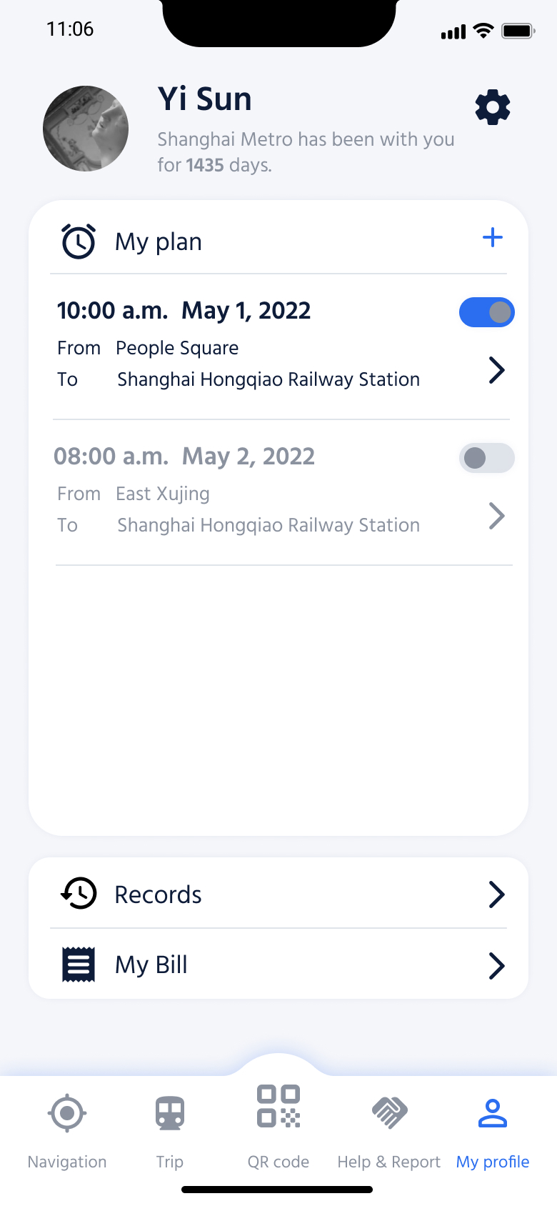
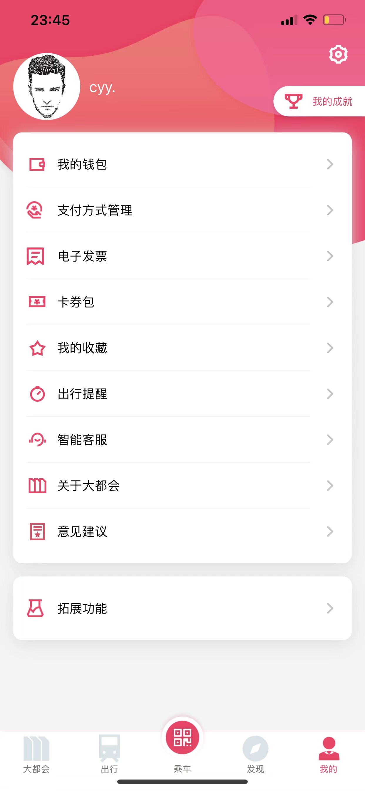
Here’s all the account information. Users can view all the personal trip reminders here, add new reminders and turn off the existing ones.
.png)


After completing the design, I conducted a walkthrough with some designers and received some valuable feedback.